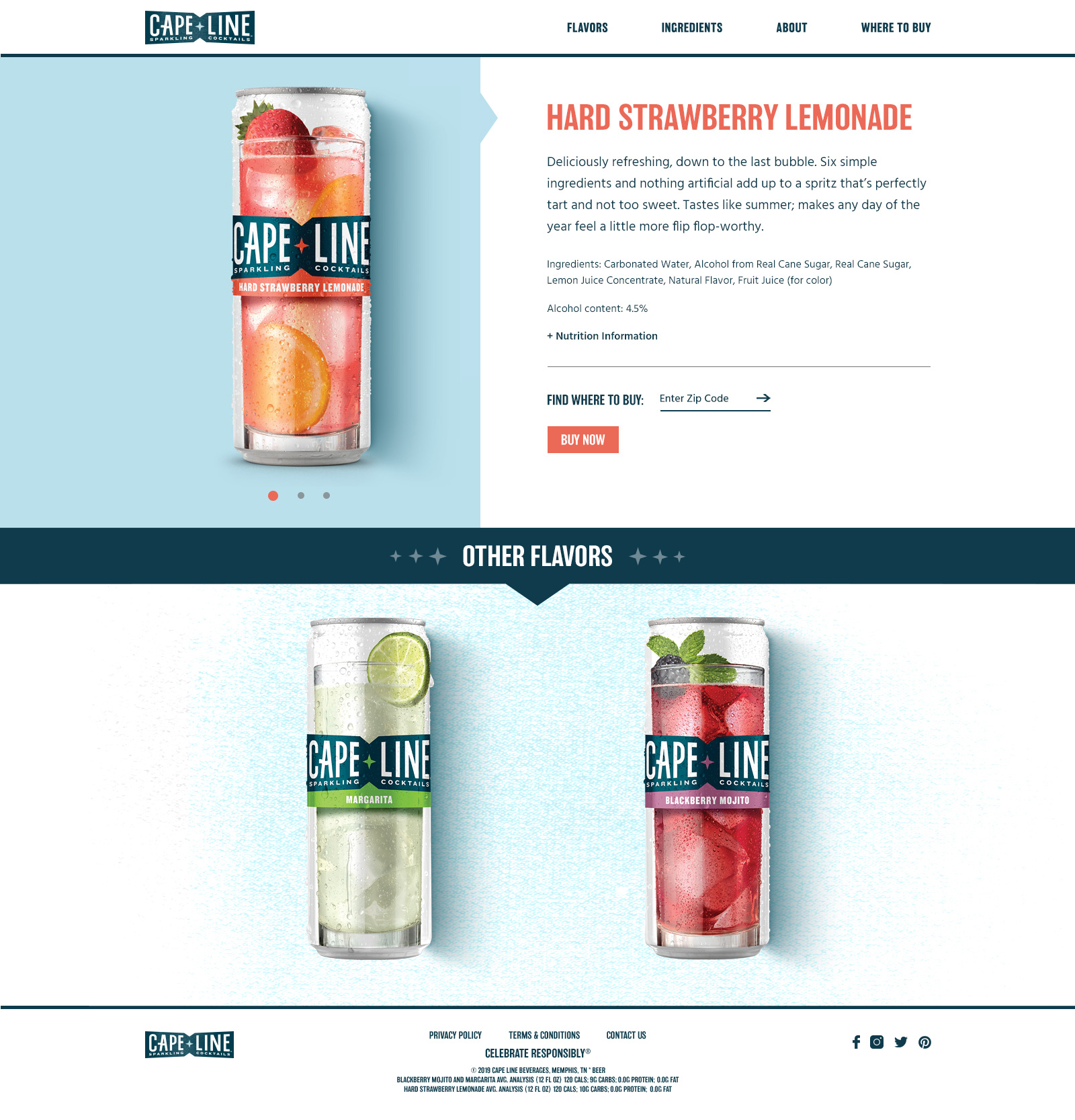
Cape Line Sparkling Cocktails is a brand new drink from MillerCoors that launched in April 2019. I was the lead designer for the responsive website design for this new brand, helping to create a look and feel for the brand and integrating motion to keep the user engaged. The design process involved research, sketching, creating mood boards, UI/visual design, prototyping, style guide creation/annotation and QA testing.
Mood Board Creation
The majority of the design process took place while the brand’s visual language was still being defined. We worked closely with the branding agency to create a look and feel that was consistent with the brand’s direction. Mood board influences included the brand ID fundamentals and branded experience guidelines created by the branding agency, competitors’ site research and acquiring inspiration from modern sites.
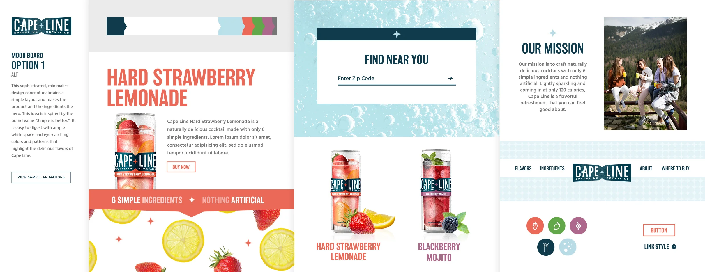
Mood Board Option 1
Inspired by bright pops of color pulling from Cape Line’s packaging and the 6 simple ingredients Capeline is created with, this moodboard embodies the brand value “simple is better”. It is a sophisticated, minimalist design concept that maintains a simple layout to make the product shine.
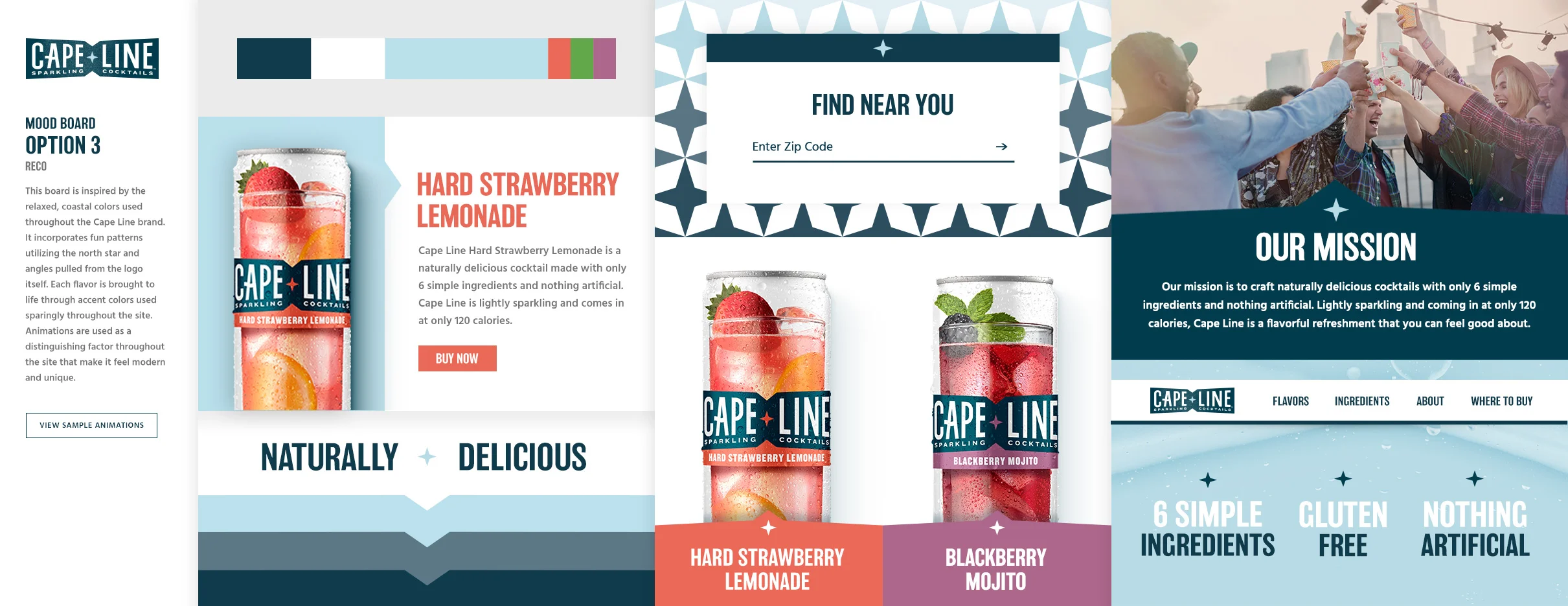
Mood Board Option 2
This mood board is inspired by the relaxed, coastal colors used throughout the Cape Line brand. It incorporates fun patterns, utilizing the north star and angles featured in Cape Line’s logo. Each flavor is brought to life through accent colors which are used sparingly throughout the site. In this mood board, animations are used as a distinguishing factor throughout the site which makes it feel modern and engaging.
Homepage Design
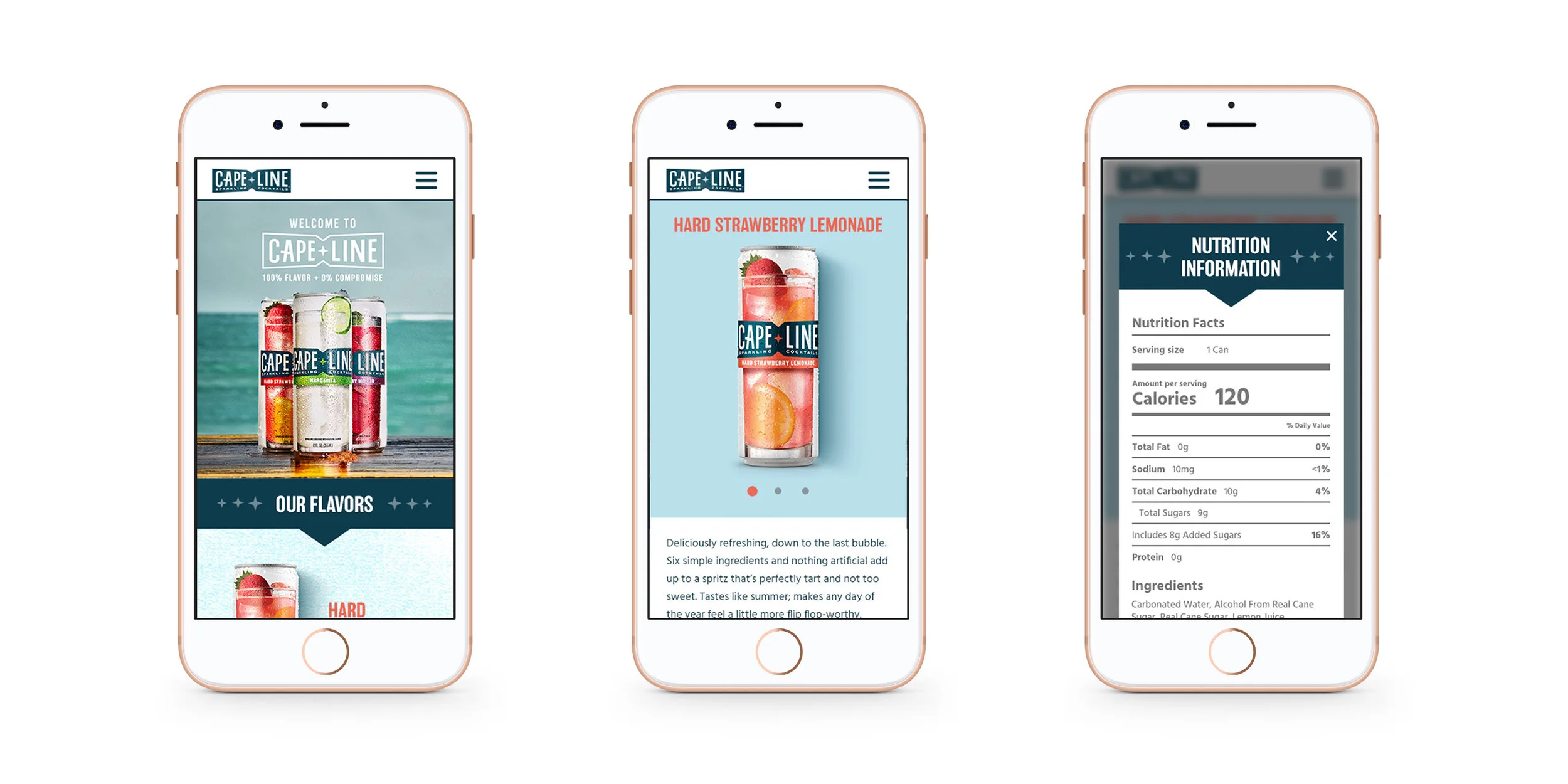
Responsive Page Design
Credits
Client: MillerCoors®
Agency: EnergyBBDO
Team: Cori Stankowski (UX), Lucy Butka (Copywriter)
All photography, copy, icons are property of MillerCoors
