Home Instead Logo Redesign
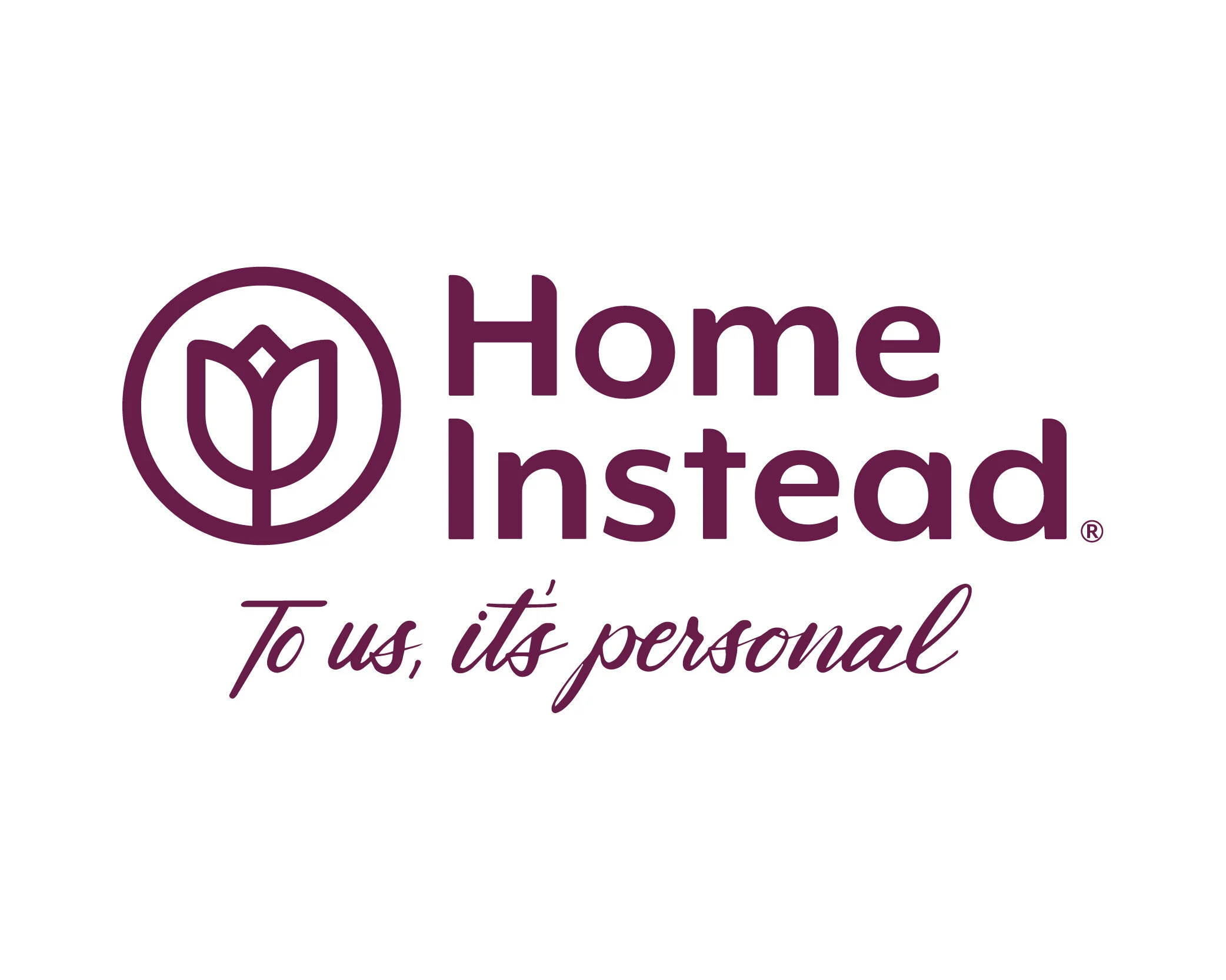
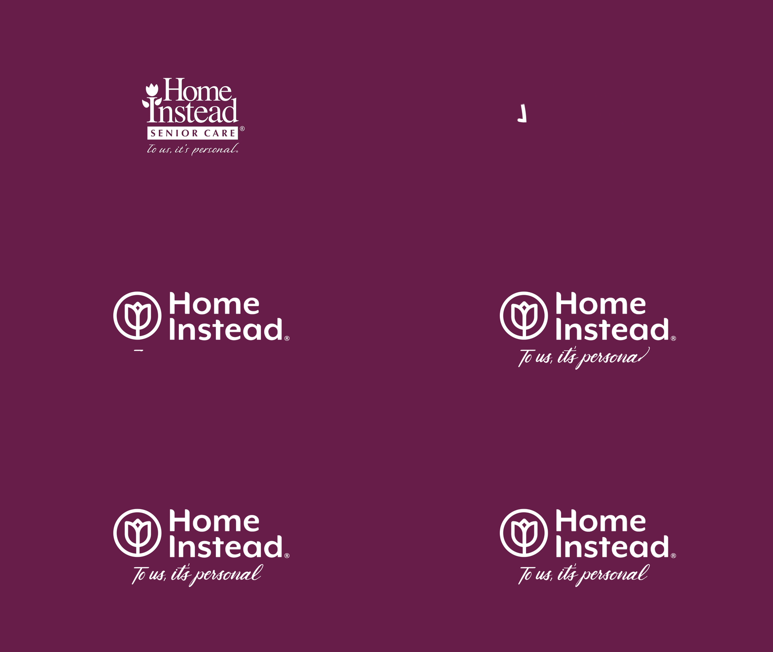
Home Instead approached Energy BBDO with the challenge of designing a new logo that could be used globally as the primary identity of the brand. The task was to explore a new logo that helped to evolve and modernize the brand while remaining timeless. They also aimed to create strong distinction for the brand across traditional uses as well as digital and social environments. The tulip, which was a main element of the original logo, was updated to an icon that could be used either locked-up with the full logo or as a standalone icon in a variety of applications. Housed within a circle and utilizing a handwritten tagline, the logo represents optimism, hope, timelessness and the circle of friends and support that is intrinsic to the Home Instead brand.
Logo Transformation
Global Markets
German Market - Tagline Variation
French Market - Tagline Variation
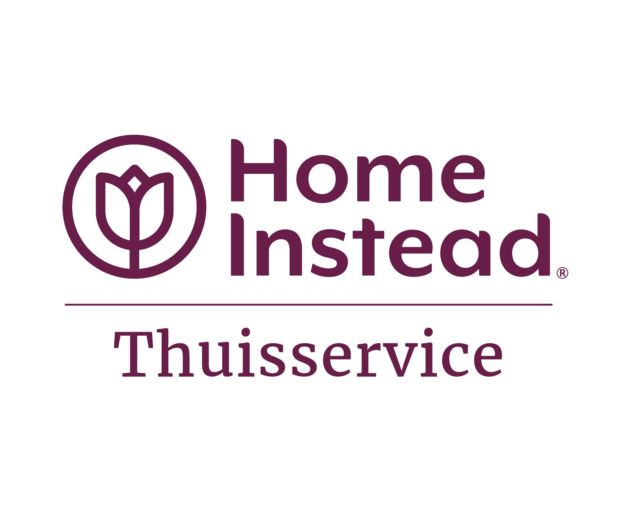
Netherlands Market - Descriptor Variation
Chinese Market - Descriptor Variation
Sub-Brands
In addition to a master brand identity, we were challenged to create a consistent look and feel for Home Instead’s numerous sub-brands that still kept the master brand in focus. The logos needed to be flexible for future iterations or growth. EnergyBBDO landed on a strategy that breaks these sub-brands down into two key categories - a branded house structure and an endorsed brand structure. The branded house structure is used when communicating specific service offerings or programs within Home Instead. Endorsed brand logos are used in instances where the specific initiative, program, or offering is intended to be the main focus. The tulip icon and main fonts remained consistent in order to continue to build strong brand attribution and presence.
Branded House
Endorsed Brand
Credits
Credits
Client: Home Instead®
Agency: EnergyBBDO
Team: Erin Knott (Lead Designer), Hung Vinh (Head of Design), Tess Barnes (Jr. Designer), Jaehyuk Choi (Motion Designer), Amanda Nieman (Account Supervisor), Pete Ruest (Group Account Director), Casey Conway (Strategy Director)
All photography, copy, icons are property of Home Instead.


